Pivot Tables is the AMP functionality that allows you to perform in-depth analyses of your advertising campaigns. Here, you can intuitively analyze active campaigns across all your platforms at any level: campaign, ad set, and ad.
- Complete Your Naming Convention
- Introduction
- Dates and Comparisons
- Filters and Pivots
- Metric Presets
- Graph Visualization
Naming Convention Setup
To use the Pivot Table, you must configure your naming convention in your AMP organization. This allows us to identify and classify your campaigns, enabling you to utilize your naming convention values and analyze your campaigns in detail.
Visit this article how to set up your naming convention in AMP and once you have completed it, return here to continue learning how to use the Pivot Table.
Introduction
The first time you access Pivot Tables, you will see a data table with a standard configuration of pivots, filters, and dates. Here, we'll show you how to customize this table to your liking and make it your daily campaign analysis tool.
The dynamic table configuration is accessible from two different points, as shown in the image below:

Once you click on the date editor or the settings button, a window will open with three menus: Date Ranges and Comparatives, Filters and Pivots, and Metric Presets. Let's explore each of them below.
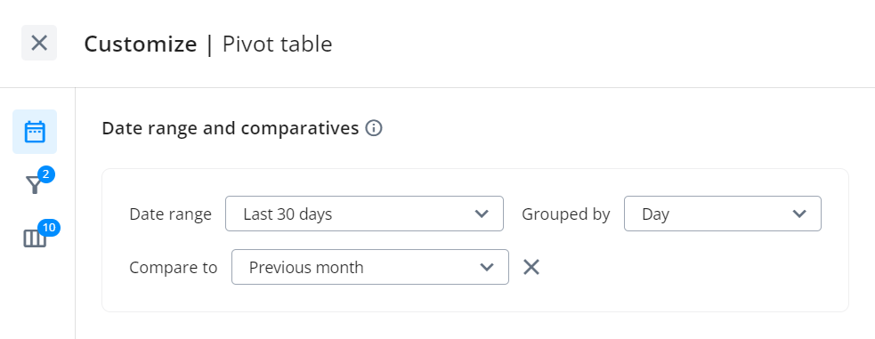
Dates and Comparisons
In the first part of the configuration, you'll find the date selection section where you can choose the date range you want to analyze. You can also select how you want to group the date range: daily, weekly, monthly, quarterly, or annually.
Additionally, you can choose the date range to compare against the selected range.
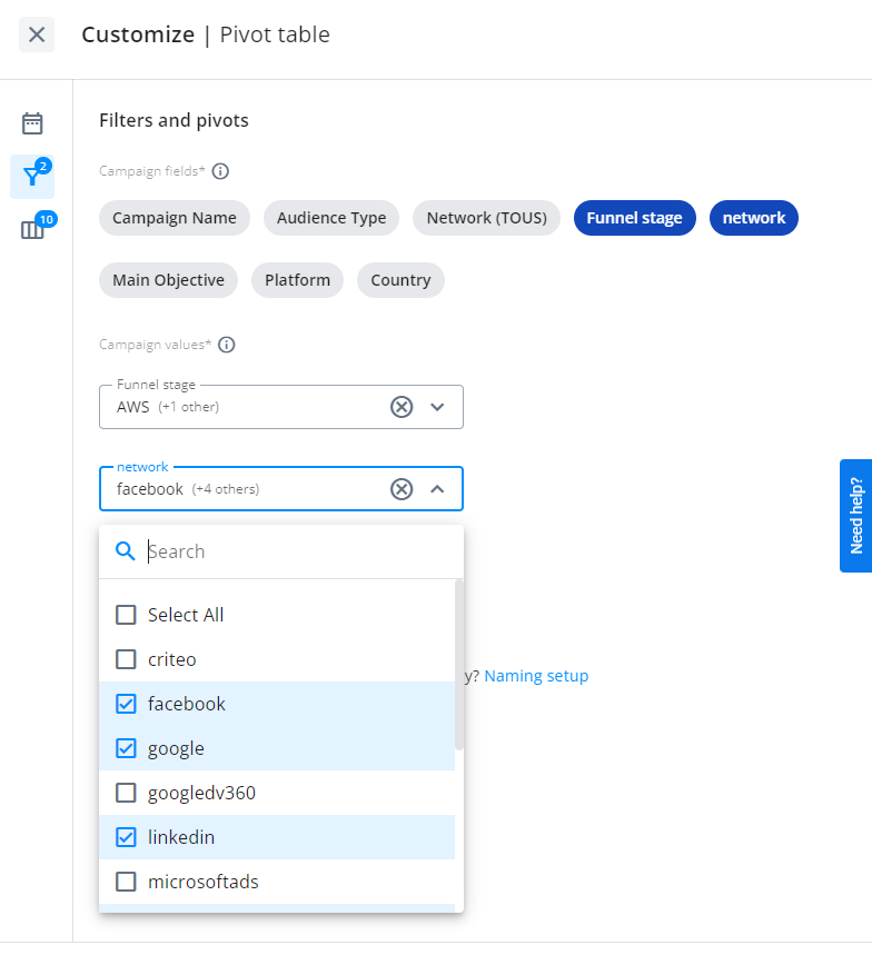
Filters and Pivots
In this section, you choose the combinations of your naming convention values that you want to analyze in the Pivot Table.
Keep in mind that you don't need a table with infinite combinations of your values, so select only what you want to analyze and visualize using the pivots and filters:
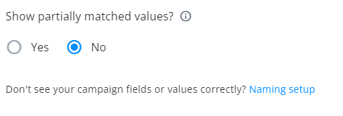
You can also choose to display campaigns in the table that do not have fully configured naming convention values in AMP:
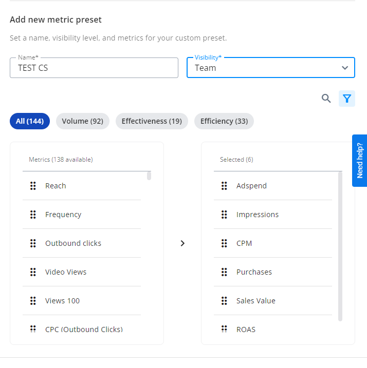
Metric Presets
In the last section, you can choose the set of metrics you want to analyze. We provide several default templates, but you can always create your own using the “+” button and choose whether others with access to the organization can see that preset using the visibility picker:
Graph Visualization
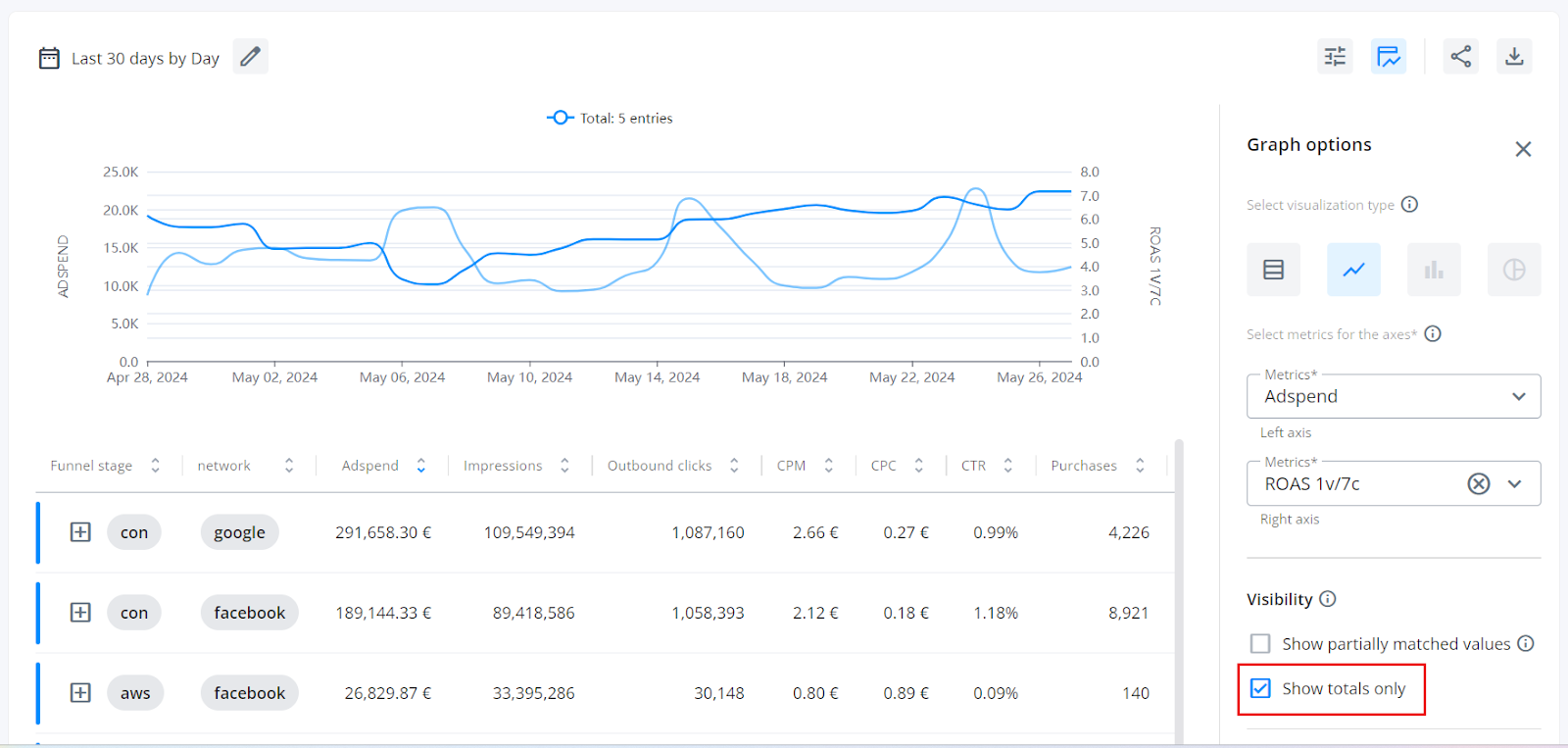
If you want to work with graphs, you can do so by directly accessing the graph option by clicking the button next to settings and start working with the metrics you want.
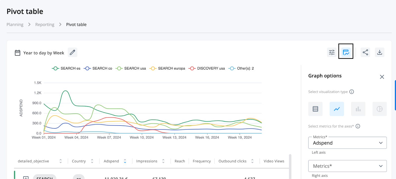
You can visualize two metrics at once by including a new metric on the right axis:
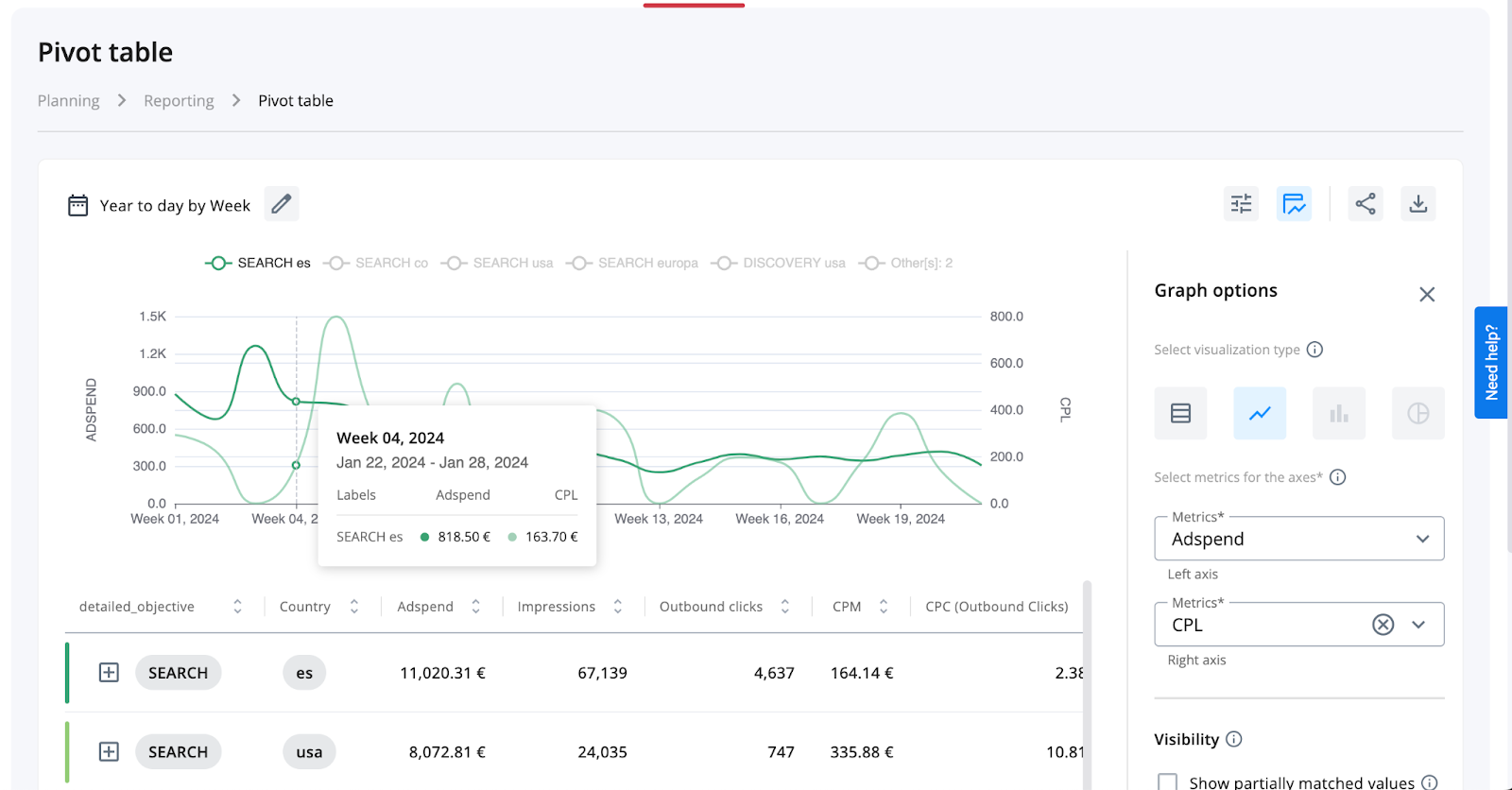
Remember to group the dates by any option other than "Entire range" because otherwise, the graph will only show a single point, and you won't be able to see the historical metrics.
Additionally, you can choose to only view the total metrics of the entire table in the graph by activating the option just below where you select the metrics to view: